Monday, 7 May 2012
Redefining the second concept
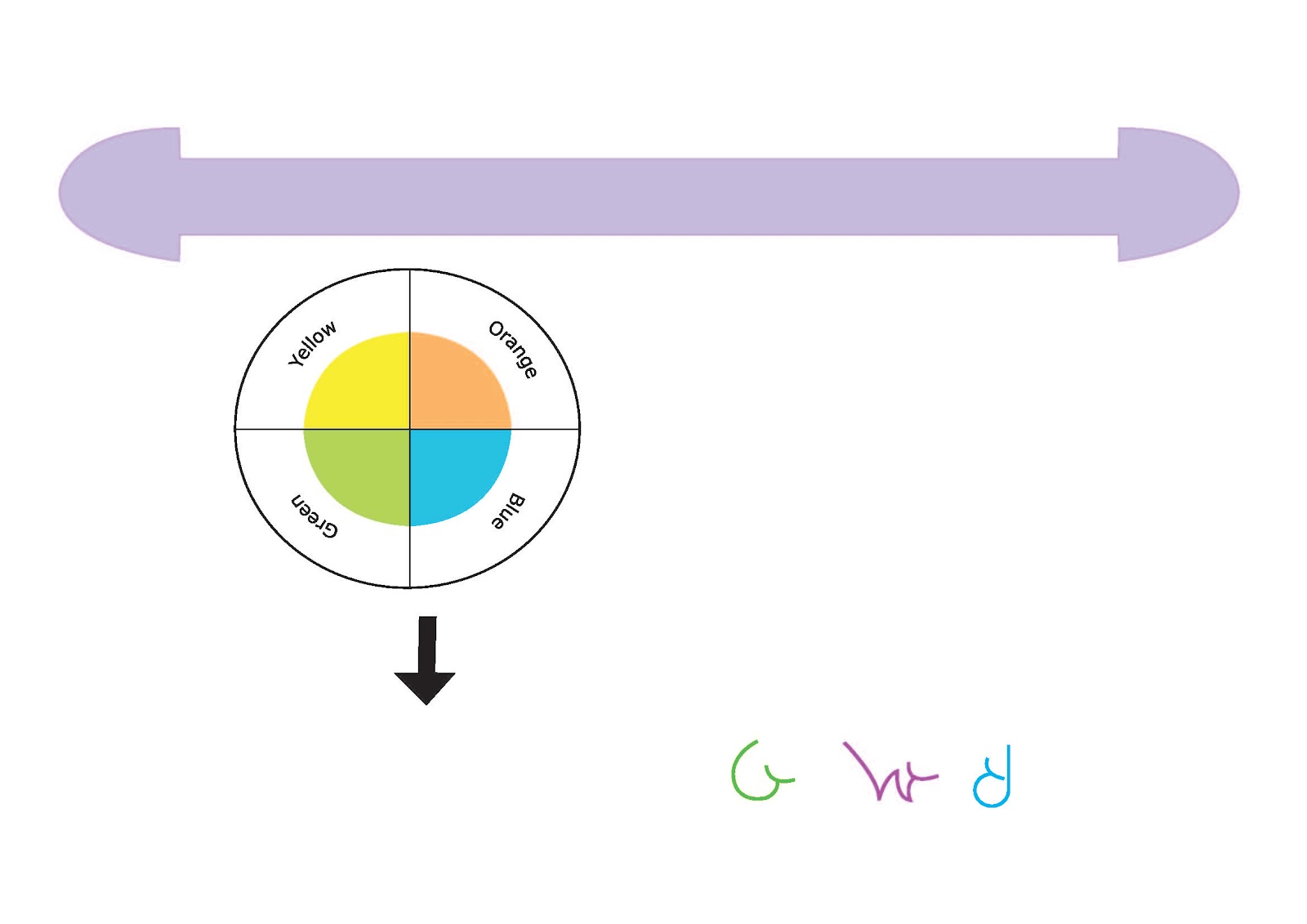
When I was in class last week I was told that it would be better to have the curved shape still at the bottom of the page but over an entire spread instead of a curved shape for each separate page to bring the page spreads together. I was also told to only have this shape up until the page about the company and not the technical information. Also I was finding it hard to think of an interesting way to set out the front and back cover and inside pages. I was given the idea of using the curved shape but instead of making it orange, making it white and having the background orange so it looks a little like a sunrise not giving too much away about the company and how the logo looks. I was told that was an important aspect to think about.
Second concept for the style guide
My second concept for the Sustenance style guide is to maybe focus on the shape of the logo to depict an aspect of the logo and overall branding of the company. I did want to use a similar colour to what is used in the Sustenance logo still though. I thought why not have a curve shape at the bottom of each page to make it interesting and connect with the logo shape and colour, using an orange or orange-yellow colour. I didn't want to make it too thick so it would assist in the overall theme of the company but not overtake from the important information being set out on each page.
First concept behind the style guide
I was told in the last week or so that the concept behind the layout of my style guide needs to be interesting and use a certain aspect of my logo design or packaging to represent the company in a way. As I thought about this I looked at the shape of the logo and the colours used. First I was thinking of using the orange and red colours used in the Sustenance logo design but was told this was too close to the logo colours so it didn't work well with the whole design. So I have had to re think how I am going to tie in the logo with the whole design and how I am going to lay out the text and images in an interesting way while have great spatial awareness.
Style guide design
So I have researched a few different kinds of style guides and have found that a few of the most useful designs are from Coca Cola, Batelco and Burj Dubai each of which were a part of the links on moodle. I found that coca cola and Burj Dubai style guides were useful to see how to set out a colourful and interesting design using a very simple three column grid system. All these style guides were also in landscape format which is what I want to use to set out my own Sustenance style guide and branding book.
redesigning the sustenance logo
Thursday, 19 April 2012
Chosen Sustenance Logo design
Sustenance Logo


My initial thought when researching about
packaging and different aspects that would capture a child’s imagination was to
create a packaging that is both functional and interesting in appearance. I
first thought was to design the box in the shape of an Australian animal or a
fruit face to connect the packaging with Australia and health eating.
As I continued to narrow down my ideas I
wanted to develop a game that will help children interact with others and learn
valuable skills in a fun way. I thought of all the games I played when I was a
child and one of my favourites was Pictionary. As many children love art,
drawing, acting and crafts I thought this was a good way to develop a packaging
that could work with this idea. I developed a character for the game Pirate
Lingo to make it more personal and a bit like a storybook in a way with the use
of watercolour and drawing, what the game entails. For the Pirate theme I
wanted to maybe produce a few different activities or games to make it more
interesting and engage the children more.
When I was researching different boxes and
templates I wanted to use a design that was easy to open and close, the
treasure chest or mailbox shaped box appealed to me. Mainly because of how
inviting and welcoming it looked, this is what I wanted to portray through my
design. I wanted the design to show how the food is healthy and how its like
treasure in a treasure chest. That is where my idea of using the pirate theme
came from along with pirates being one of the most common themes that children
love.
The light and dark purple as well as red
colours of the packaging were chosen because they are harmonious colours that
work well together and create a calm feeling that creates a feel of welcoming.
The red was chosen to contrast against the purple, so the vittles logo would
stand out without creating a clashing feeling or fighting with the colour of
the packaging. I chose purple also to flow almost like watercolour to give it a
softer feel connecting with the welcoming feel of the packaging. The waterproof covering of the packaging could
be environmentally friendly as I have found research for a new way through the
use of sugar cane, which is waterproof.
For the gluten free symbol I wanted to
create something simple but a little different in appearance. The shape of the G
for gluten was used but I chose to make it look a bit like a smile to show how
it is friendly, creates a better feeling and helps those around them.
Thursday, 12 April 2012


Pirate lingo - word list
I developed a range of words relating to pirates and wrote them down. There are three categories firstly clothing and equipment, act it out and weapons, movies and pirates all categories are used in the Pirate Lingo game.


Colour trial

This particular blue is diffidently too dark for the packaging background.


Pirate Lingo
The typeface I chose for the Pirate Lingo game title is simple and easy to read but is slightly animated in appearance. I think it goes pretty well with both the game and the packaging itself. Pirate lingo also uses a spinner to choose which colour to choose a word from. I also incorporated a handle onto the packaging to make it easier to carry, simple but effective.


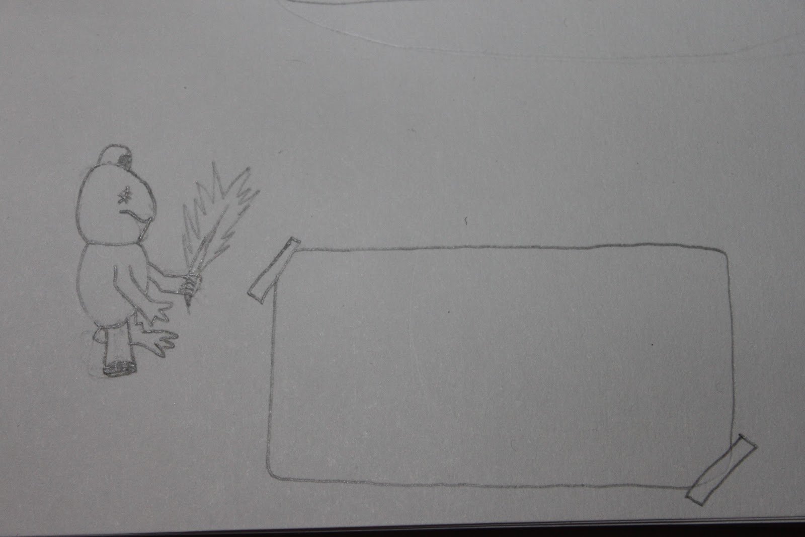
My character
I began to draw an image of a Bilby mainly because I was finding it hard to draw a pelican and a bilby would make a better pirate, children also don't know much about the bilby so it would get them interesting in finding out about them. This is the image before using watercolour and scanning it in and doing a few minor touch ups in photoshop.

After using watercolour and cleaning it up a bit and it is reflected.

After using watercolour and cleaning it up a bit and it is reflected.
Game development
I started to think about the game more so I decided that if the children were going to draw on the back of the outside of the packaging it would be better if there was a space that was directly for that process. I made a white box that looks like it was sticky taped on neatly to give it a bit of an old feel or like a white board. I also thought that I should create a character to make the game more personal, but if I was to create a character I wanted it to be an Australian Animal. I looked up possible animals such as a dingo, rabbit, pelican and the bilby. I wanted the character to be a cartoon because it will work for the shape of the packaging and the style. I also thought of using watercolour to colour the animal so it would work with the soft subtle theme of the packaging graphics. I tried to draw a frog first but it wasn't working so well.

Colour Box 2012, Cartoon pelican, retrieved from www.colourbox.com/vector/cartoon-pelican-presenting-with-his-wing-vector-3460534

I think the pelican or the bilby would work the best as a pirate and with the packaging.
Dennis Holmes 2012, retrieved from http://www.clipartof.com/portfolio/djholmes/illustration/cute-and-friendly-bilby-waving-43062.html

Clip art of 2012, Bilby cartoon, retrieved from http://www.clipartof.com/interior_wall_decor/details/Bilby-Camping-And-Cooking-Over-A-Fire-In-The-Outback-Poster-Art-Print-65111

Crickey Boy Blog 2012, retrieved from http://crikeyboy.blogspot.com.au/2010/12/dingo.html

As the packaging must state whether it's gluten, dairy or wheat free I chose to place gluten free symbol on the front packaging underneath the Vittles logo and caption for the product. When I was thinking about what symbol would work to display that the product is gluten free I could only think of an image of wheat underneath a circle with a line through it. Then I thought why not do something completely different, so I used the shape of the G and made it into a smile.

Subscribe to:
Comments (Atom)